BRAND IDENTITY
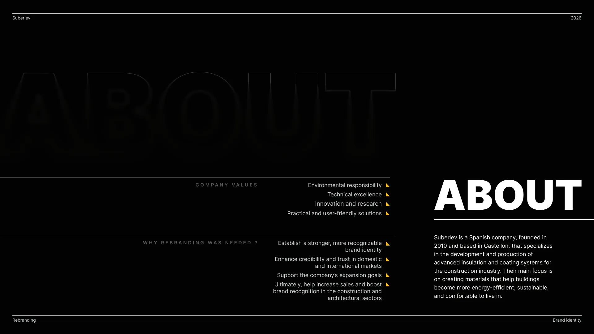
Suberlev is a young and dynamic Spanish company, dedicated exclusively to the creation, manufacture and marketing of revolutionary materials in the construction sector.
THE PROBLEM
Suberlev had strong products and technical expertise, but the brand lacked a modern and recognizable identity. The existing visuals felt outdated, inconsistent, and heavily product-focused without creating an emotional connection with customers. The website and marketing materials also struggled to communicate innovation, sustainability, and trust in a clear visual language. As a result, the brand blended into a crowded industrial market instead of standing out as a forward-thinking insulation company.
THE APPROACH
The goal of the rebrand was to reposition Suberlev as a modern, reliable, and energy-efficient brand while keeping its industrial roots. I started by analyzing the company's existing communication, product packaging, website, and competitors to identify inconsistencies and missed opportunities. From there, I developed a clearer visual strategy focused on clarity, structure, and recognition.
The challenge was to create a system that felt both technical and approachable — something professional enough for the construction industry while still visually engaging for digital platforms and marketing materials.
THE SOLUTION
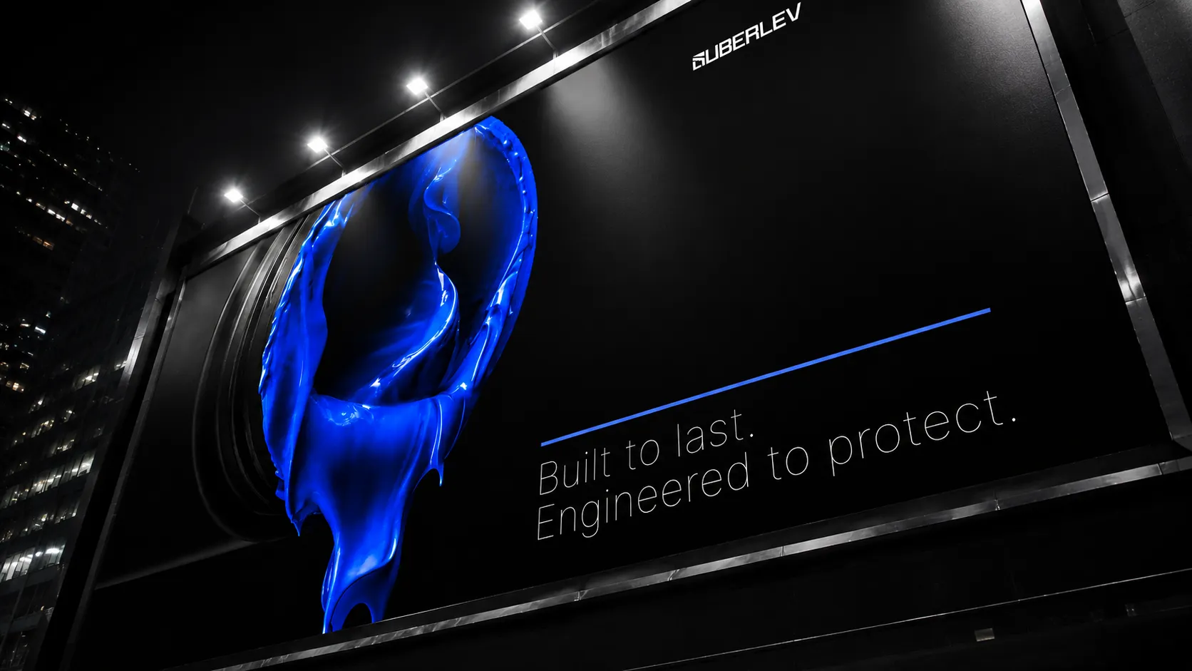
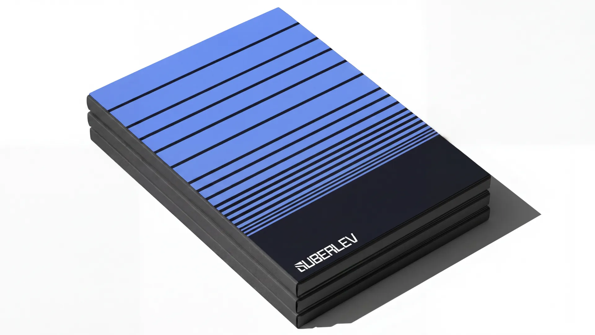
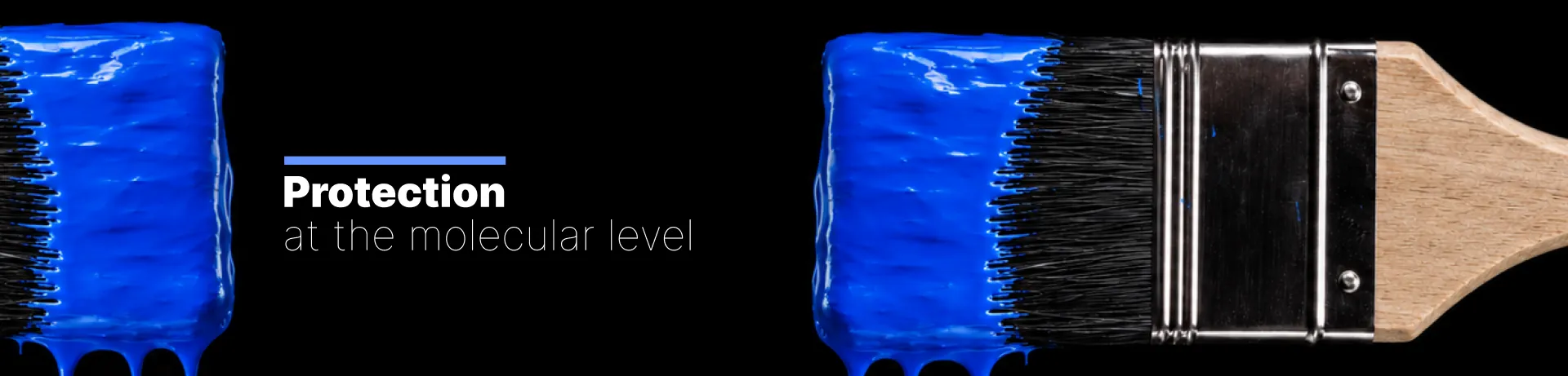
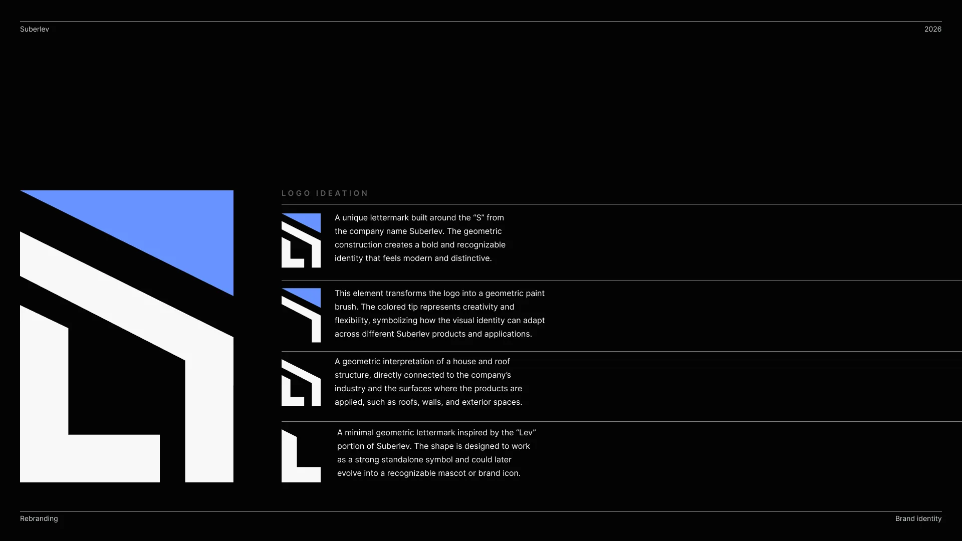
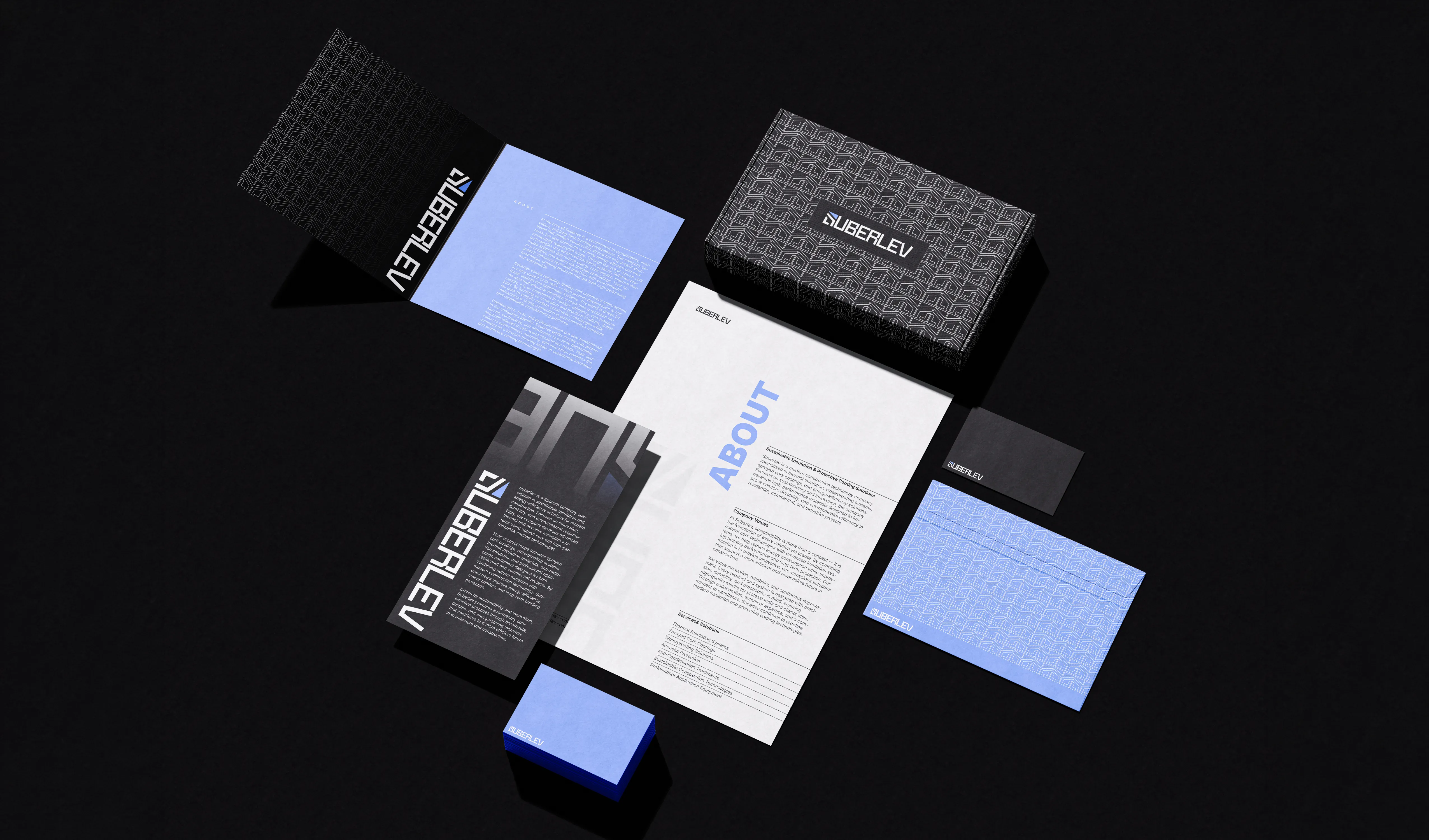
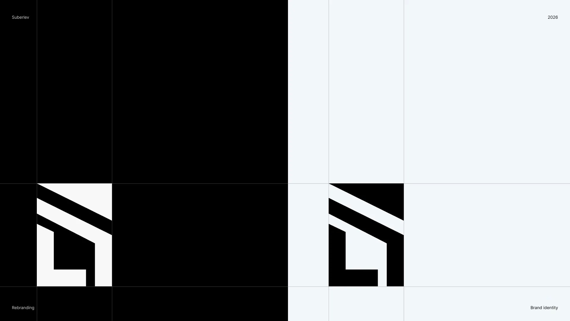
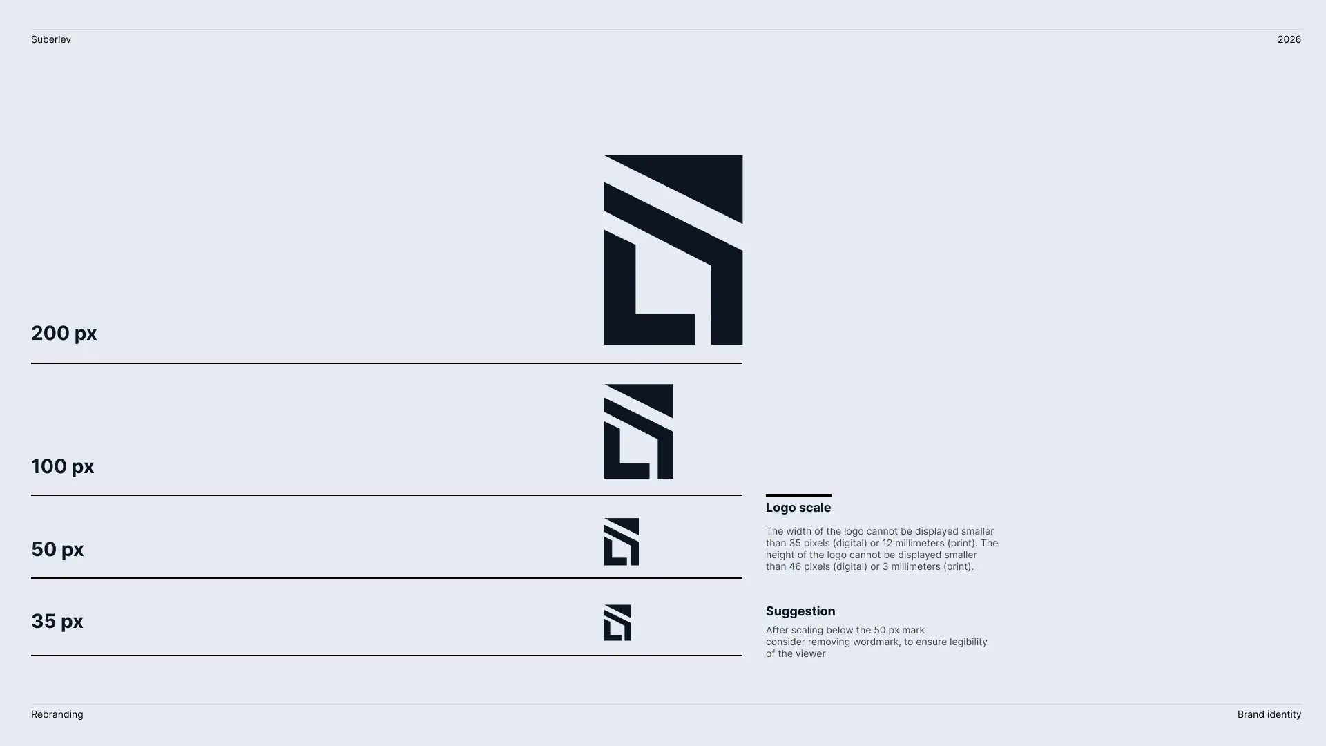
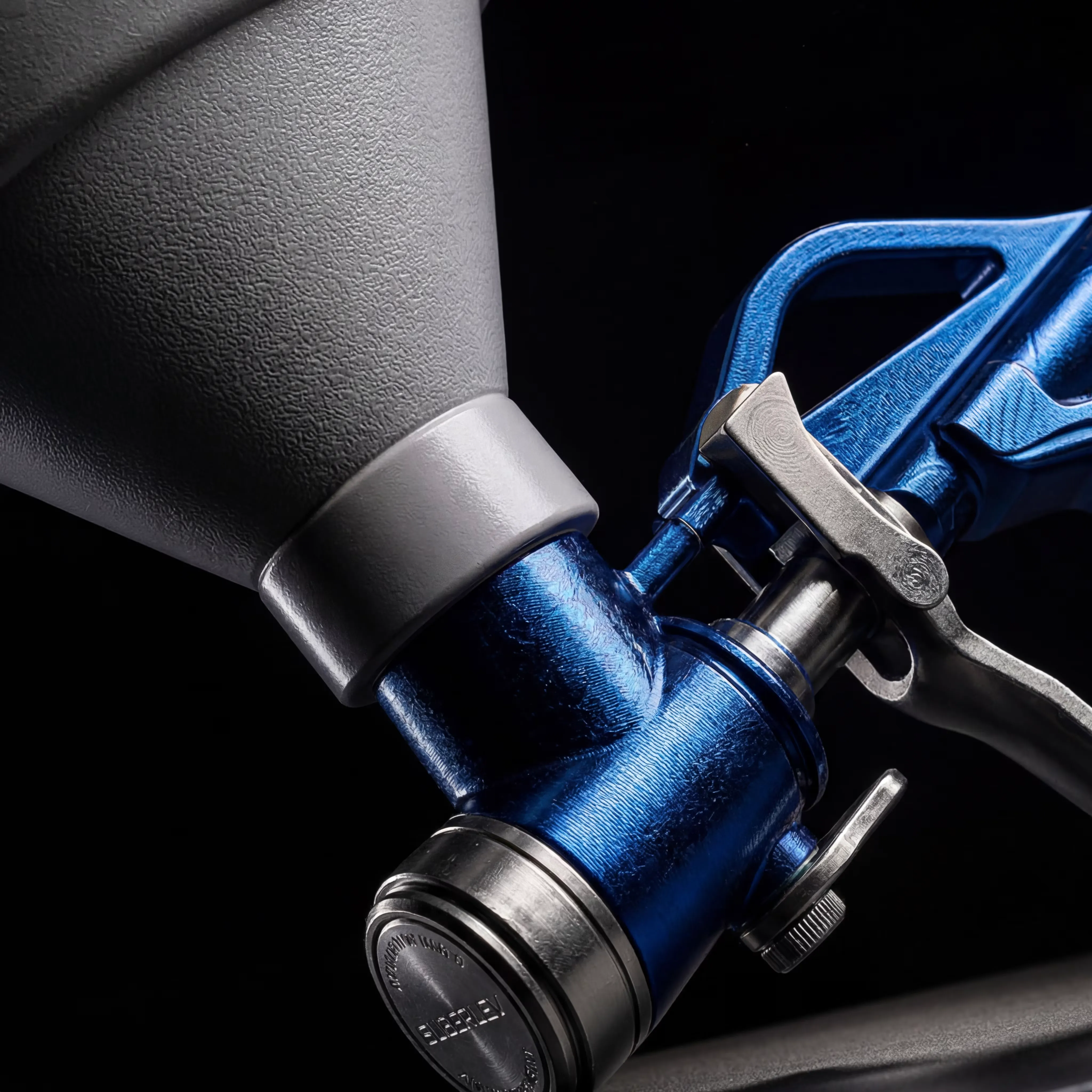
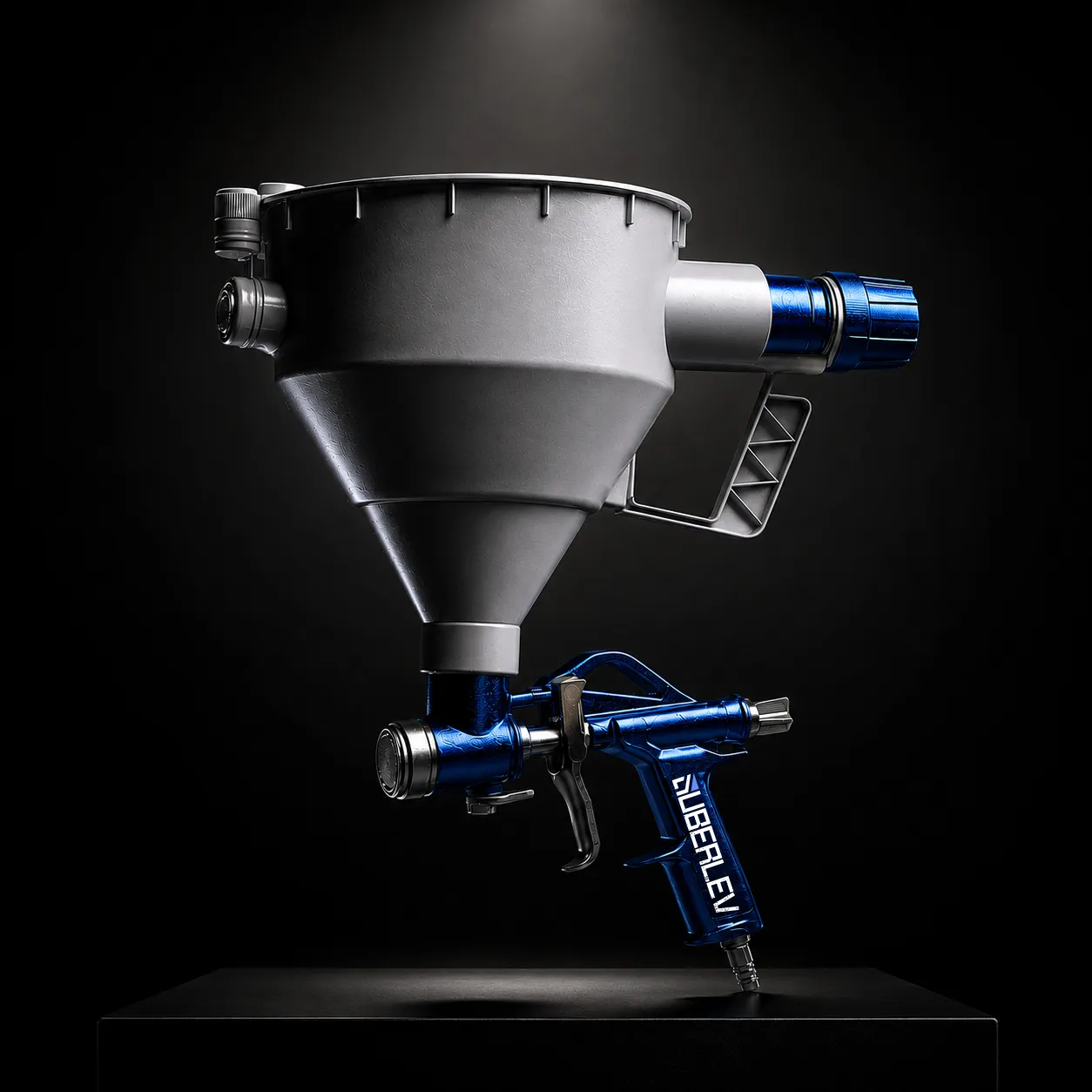
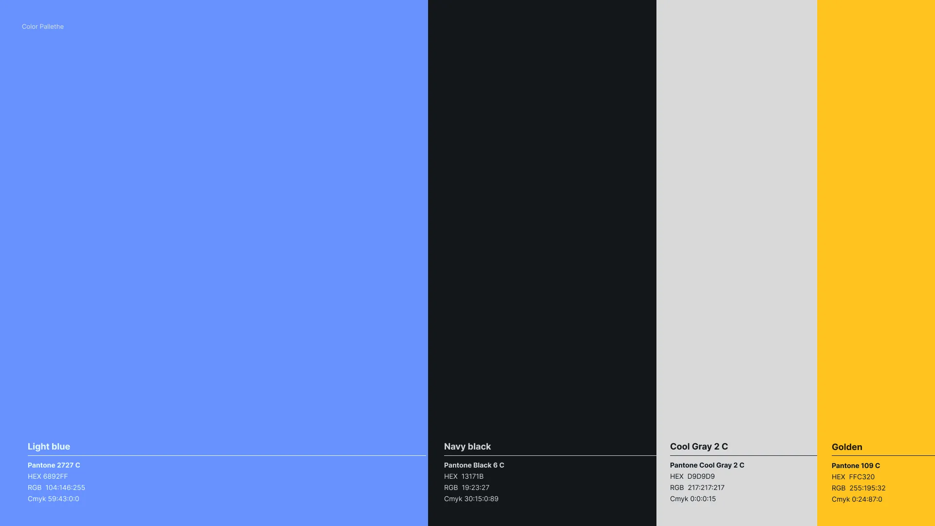
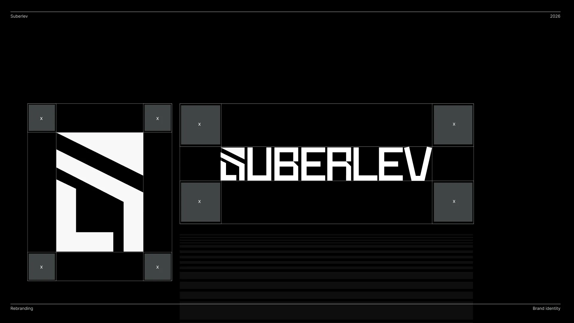
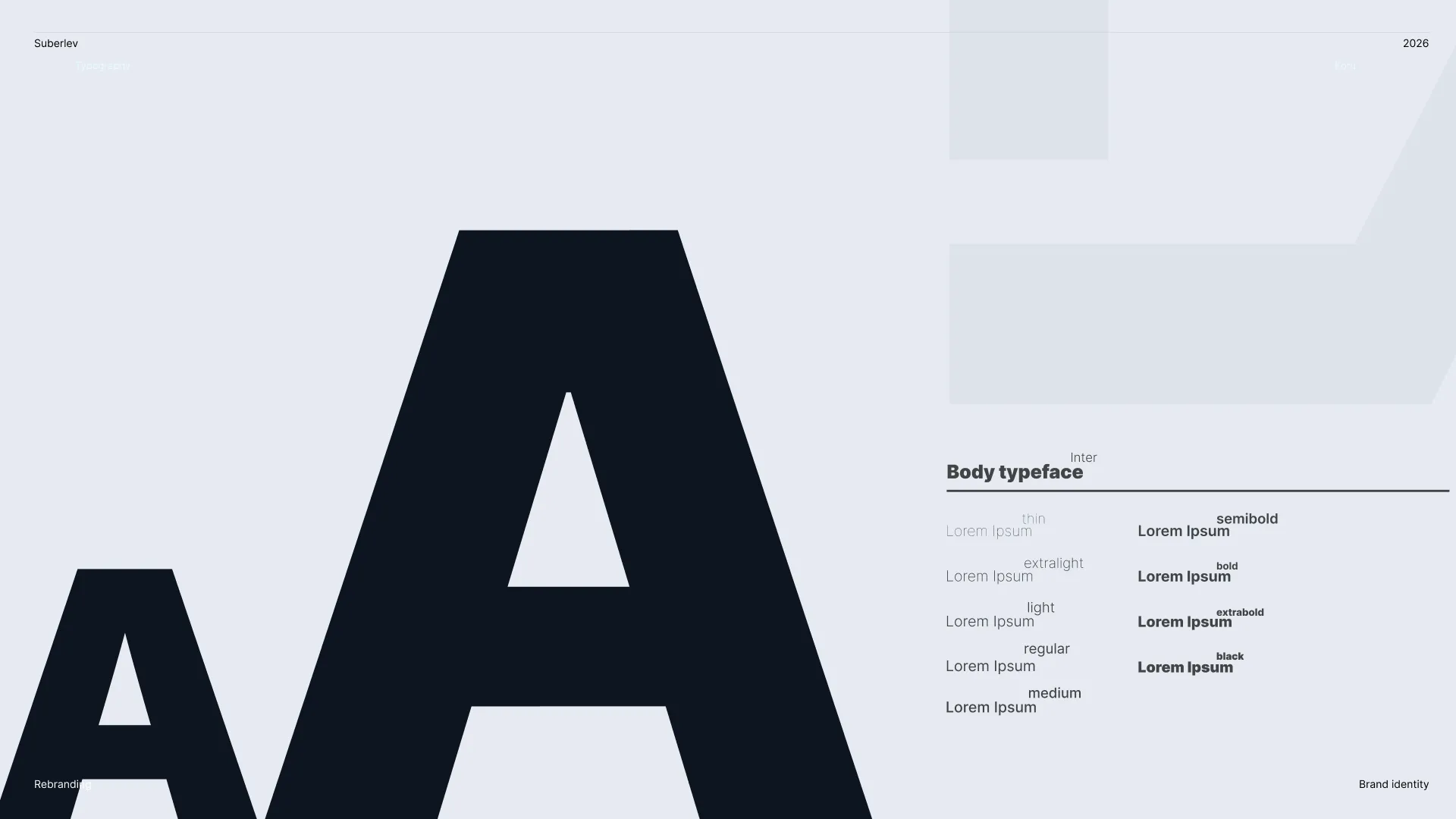
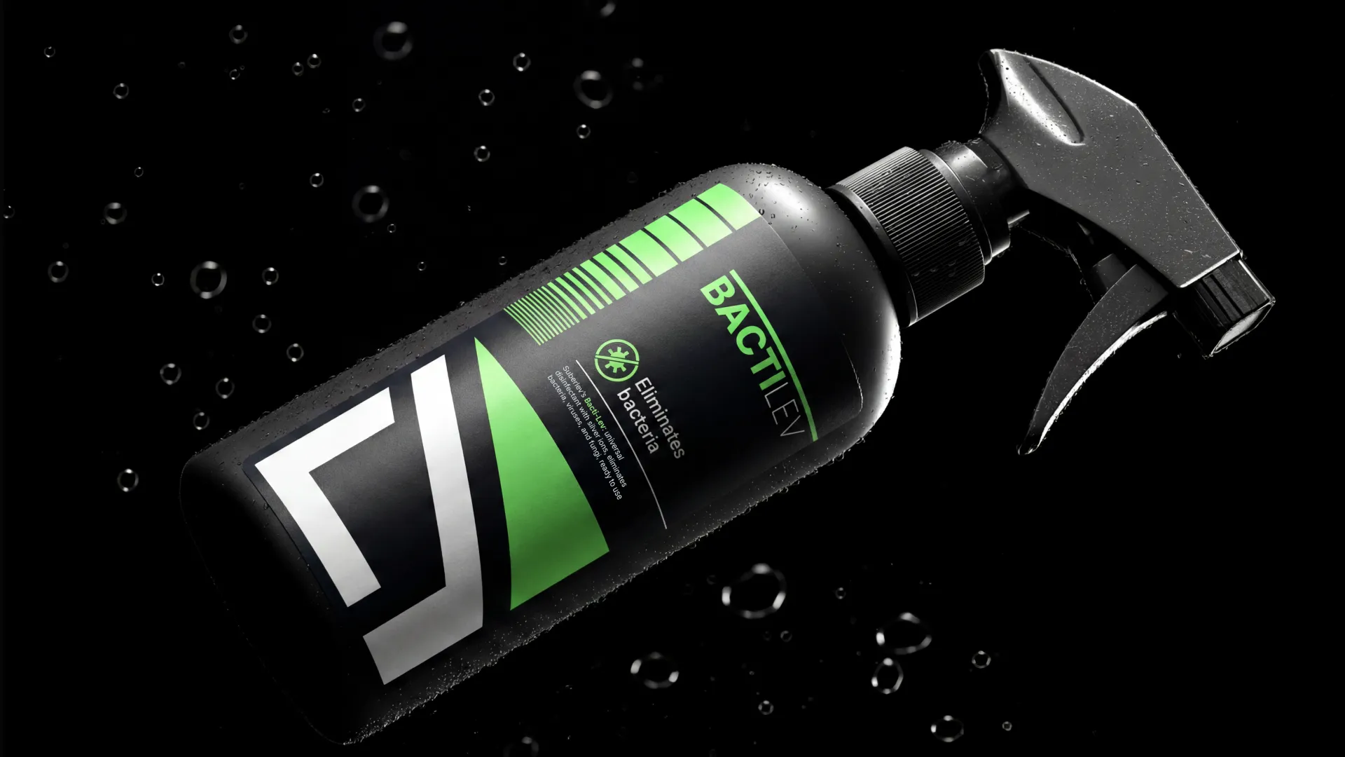
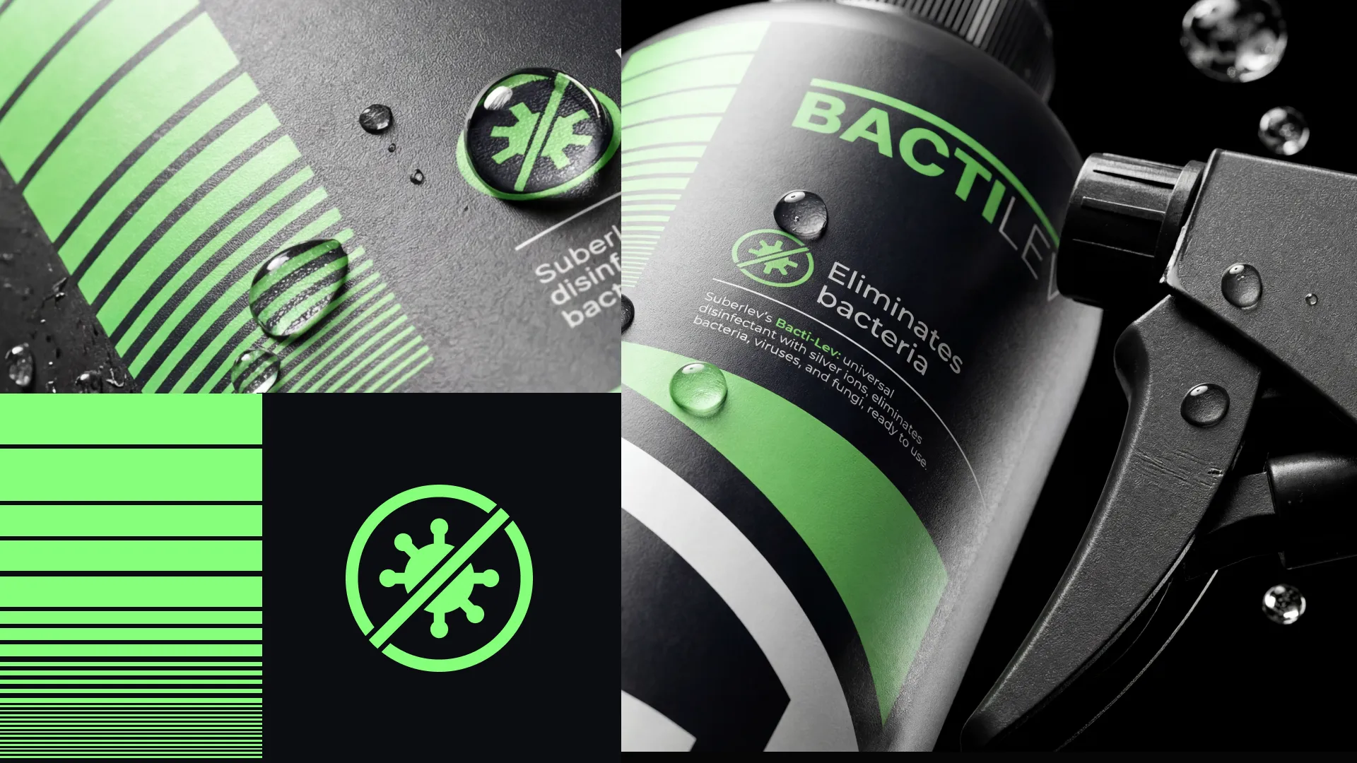
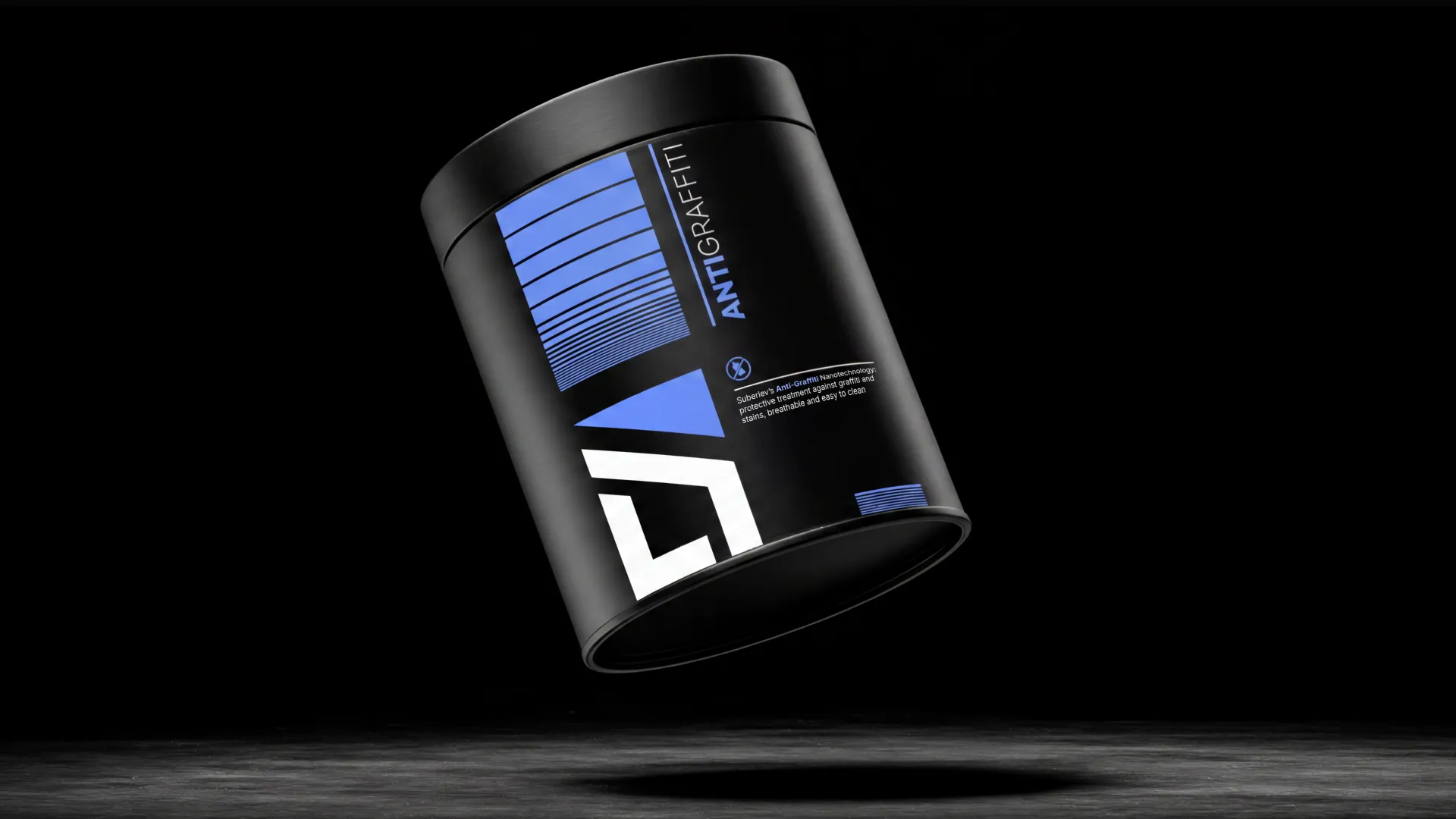
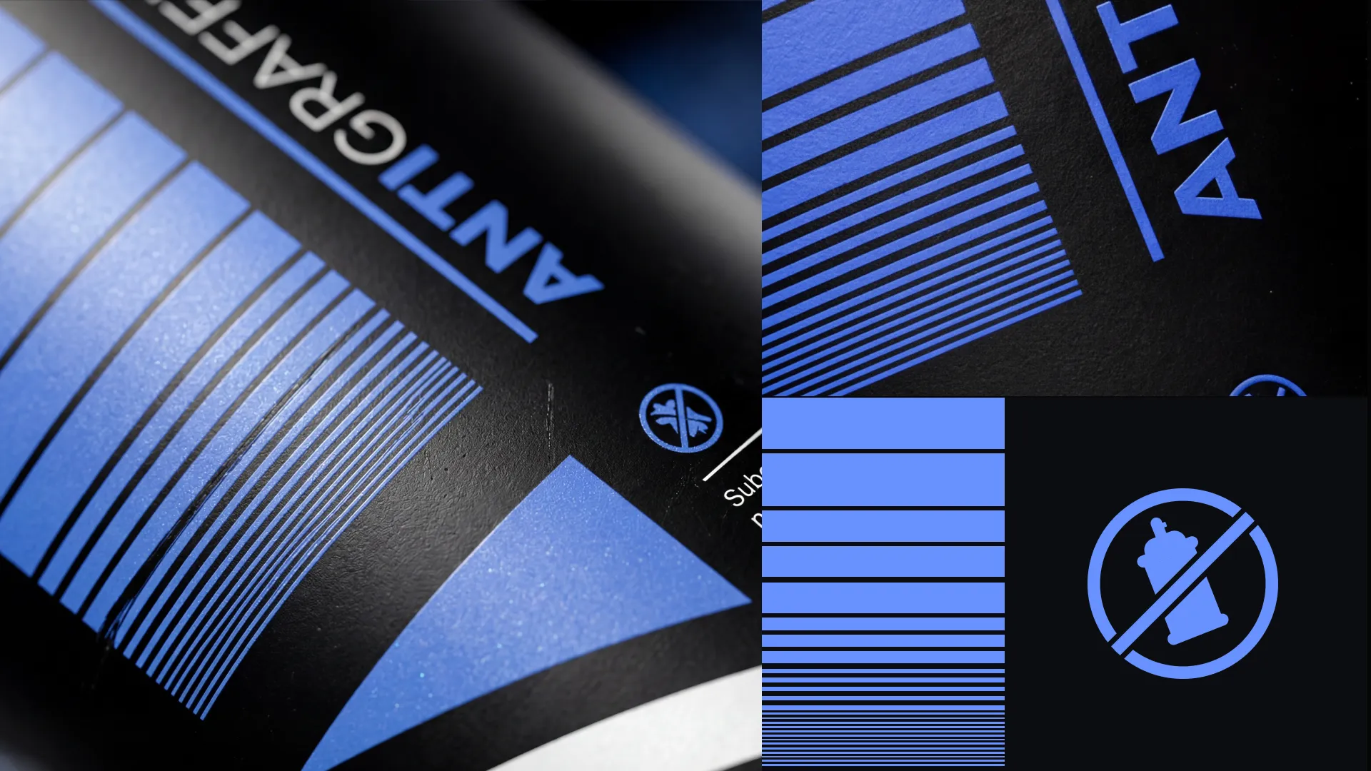
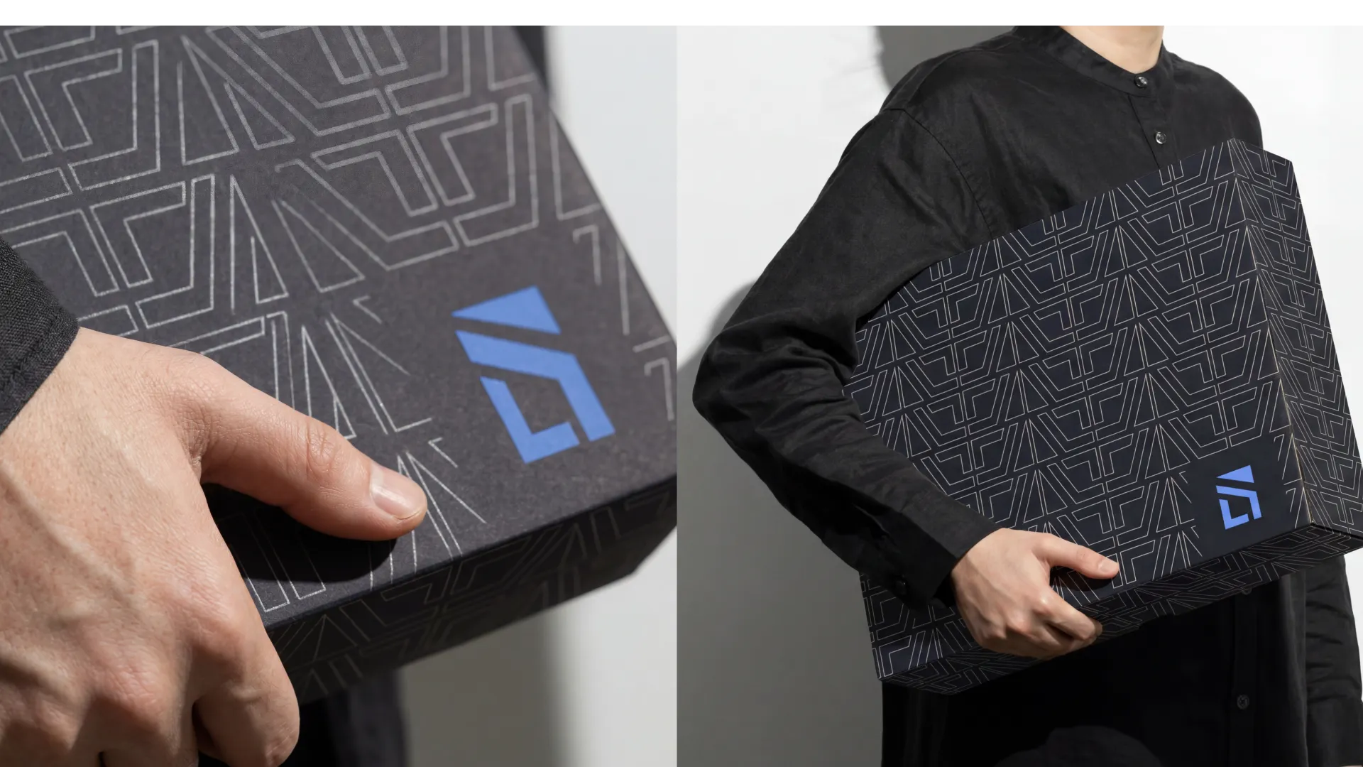
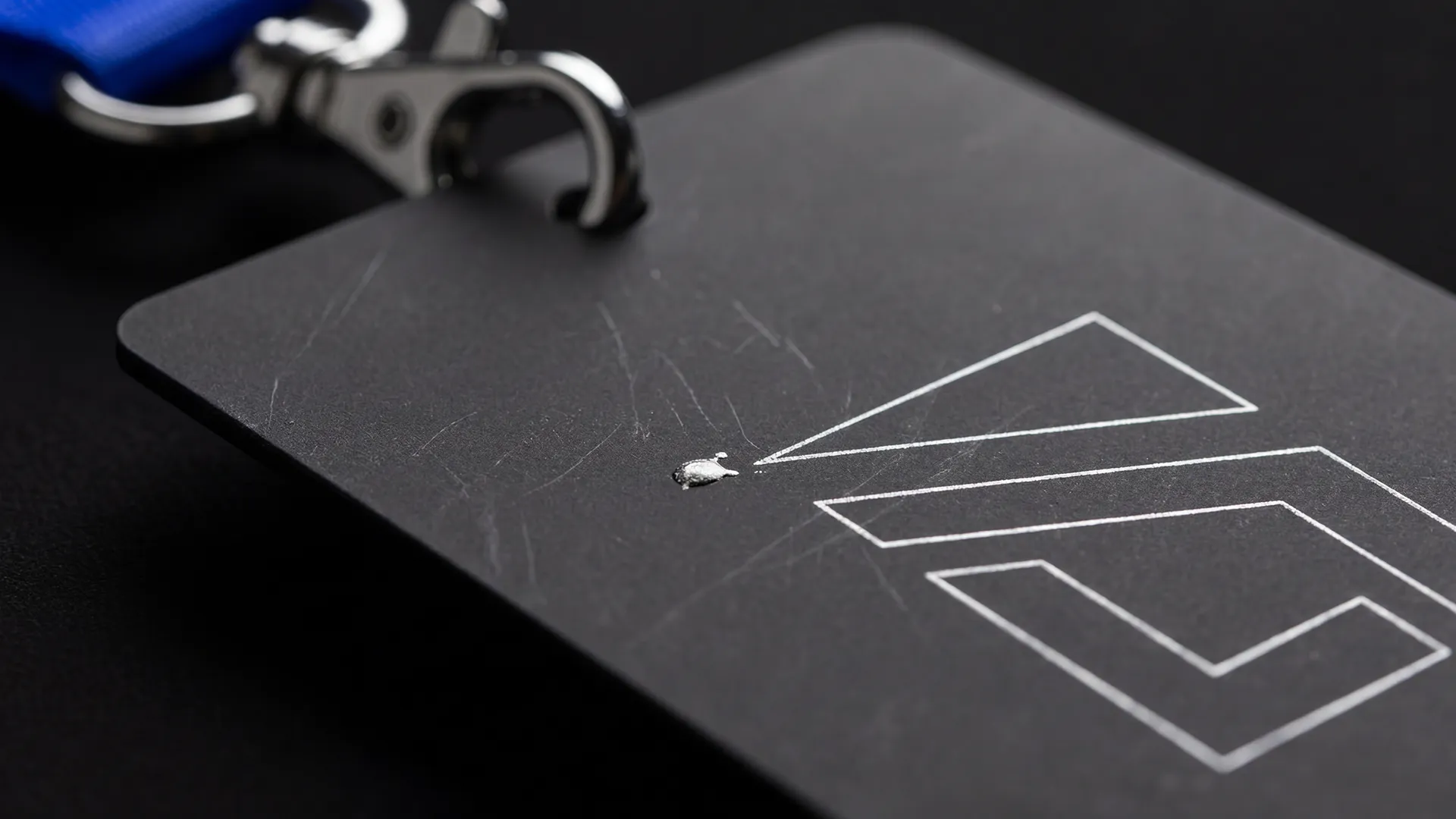
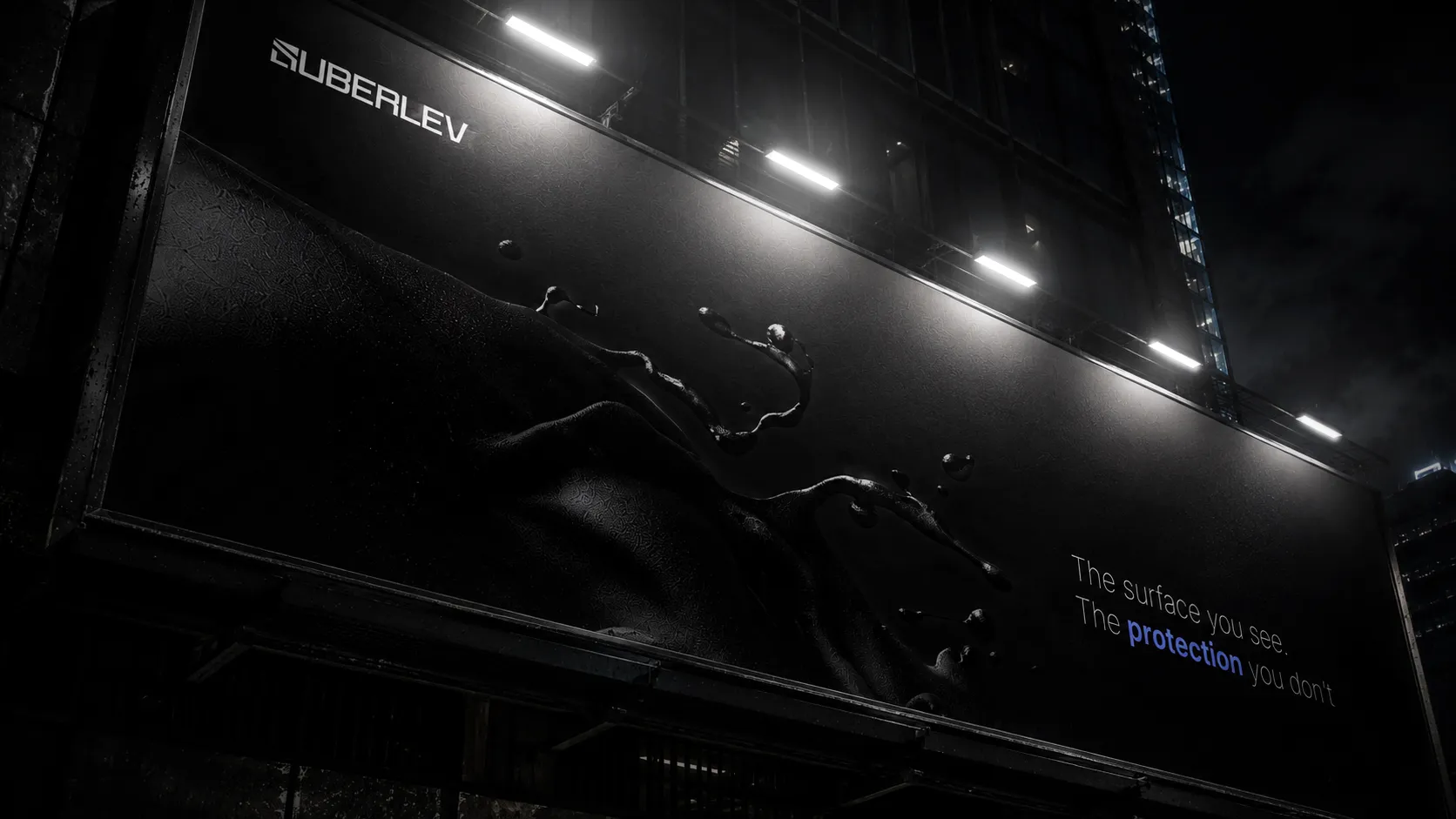
I designed a complete visual identity system centered around energy efficiency, protection, and modern construction. The refreshed identity introduced a cleaner logo execution, a stronger color palette, modern typography, and a more structured layout system that improved readability across both print and digital applications.
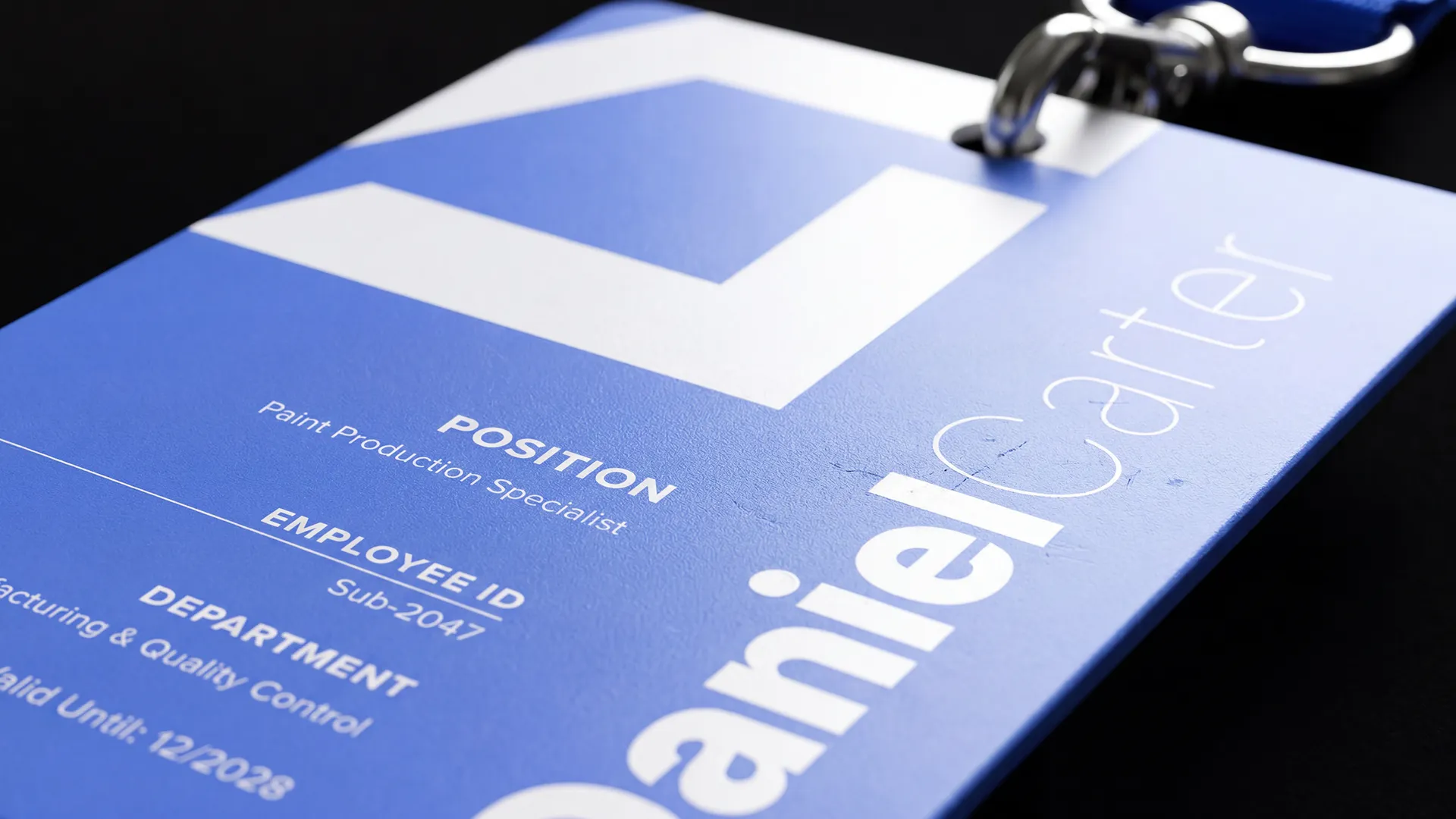
To strengthen brand recognition, I created consistent visual rules for packaging, promotional graphics, website presentation, and product communication. The new design system gives Suberlev a more contemporary and trustworthy presence while helping customers quickly understand the brand's value and product benefits.
The result is a cohesive identity that transforms Suberlev from a traditional industrial company into a modern brand with a stronger digital presence and clearer market positioning.


Brand Identity
SUBERLEV
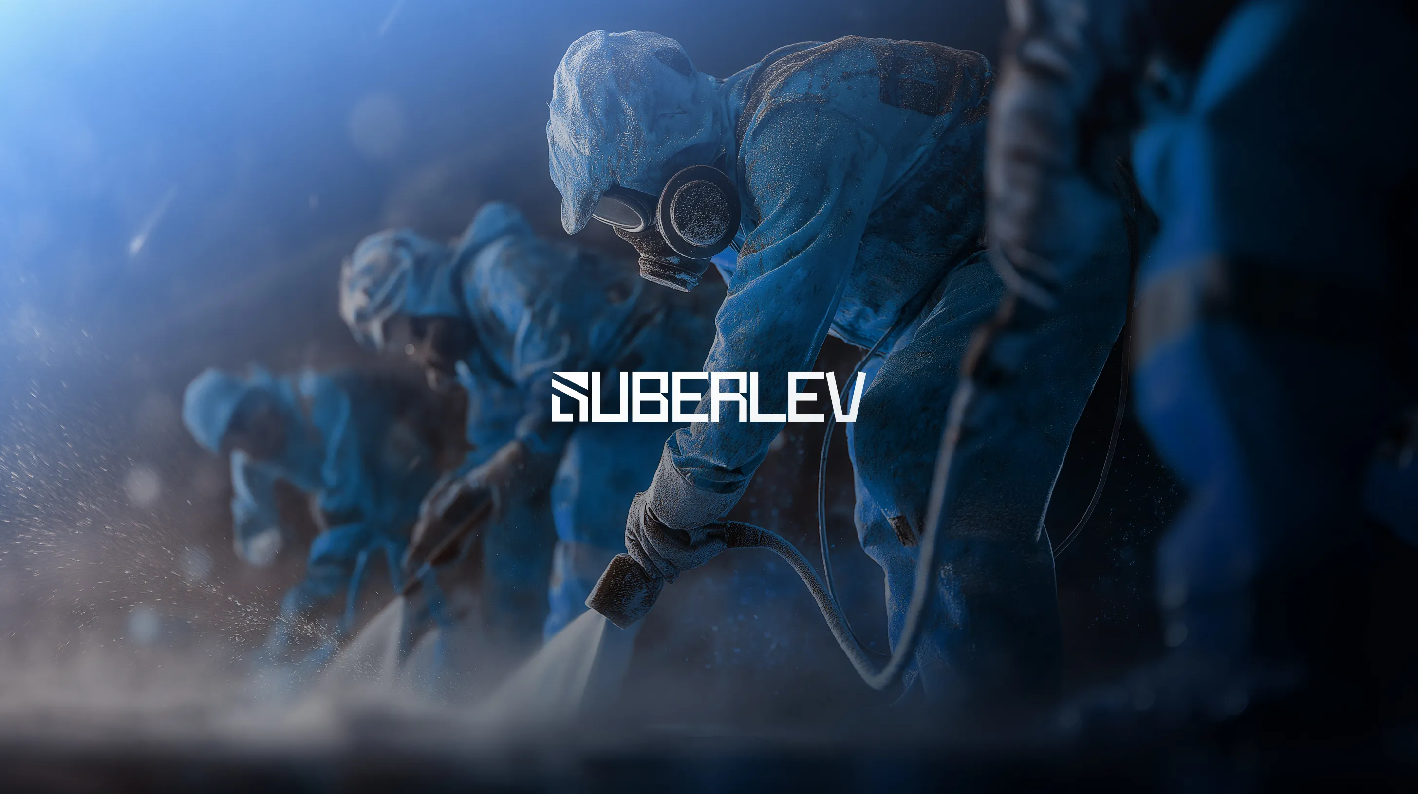
Suberlev is a Spanish company that specializes in the development of advanced insulation and coating systems for the construction industry.
The identity was built around precision, protection, and industrial strength. The visual system combines a structured grid language with bold typography to communicate reliability and technical expertise across every brand touchpoint.
Year
2026
Services
- Brand Identity
- Logo Design
- Visual System
- Motion
made in 2026